Samsung.com Flagship Configurator

Samsung Flagship Device Configurator
UX / UI
The Background
This new configurator was built for the Galaxy Note10 launch. Traffic to Samsung.com is 2 times higher during a flagship product launch so it was critical to create a better customer experience and drive more sales.
My Role
I was the only UX/UI Designer.
Worked directly with the Chief Digital Officer, the Director of Product and Lead Developer.
Business and Product Requirements
Offers must be prominent, but in a subtle way so that it does not look like a marketing page.
Offers must be selectable. Some offers can be stackable while some offers can be exclusive to device, color, capacity and/or carrier.
The SKU is resolved after the customer selects the type of device, carrier, color and capacity.

Problem 1
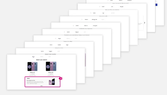
The old design was a horizontal, page-by-page configurator. Initially, sales increased with this design. However, as more products and features were added, the number of pages in the configurator increased resulting in high customer drop-off rates as there were too many pages for a customer to click through before reaching checkout.

Problem 2
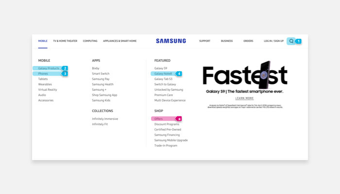
Shoppers are looking for special offers when purchasing their device. Though there are 5 entry points to purchase a phone, only one page (highlighted in magenta) showcases the offers. If a customer entered in the 4 other entry points (highlighted in blue), they would miss seeing special deals.

Problem 3
It is too easy to miss the offers displayed in the configurator. Special offers were displayed on the first page of the configurator as an ad banner carousel (highlighted in magenta). Engagement with this carousel was low and customers did not remain long enough on this page to view the second ad banner.
Explorations and Iterations


Fast Follow to increase sales
To increase sales, it is critical to cross sell the Premium Care program, which is an additional $11.99 a month per device.
The percentage of customers adding Premium Care to their purchase was dropping with this new redesign. It was urgent to implement a quick solve that engineers could immediately implement.
While the old horizontal design had too many pages, we learned from it that having the customer presented with the isolated decision to add Premium Care resulted in more conversions.
So, I brought Premium Care out of the main configurator page and designed a pop-up to clearly isolate and present Premium Care to the customer. This change helped lift the Premium Care sales back up.
While the pop-up was the quickest engineer implementation, from a user perspective, the pop-up could feel intrusive and unimportant.